Customize your Visualizations
There were two reasons for building OSMTimeLapseR. One was to visualize additions to OSM over time in Kathmandu. The other was to let other communities, particularly those with nascent OSM communities, to visualize additions in their communities. It does require a few moving parts to be fit together, but hopefully there is enough here to let folks make visualizations wherever they’re building new OSM communities.
In this tutorial, realizing that new visualizations will need to fit a new communities test, I will walk through how to customize the visualizations that OSM TimeLapseR produces. Note that these customizations aren’t as flexible as you might get with cartography tools, but hopefully can at least fit to a few different tastes.
Lets get started!
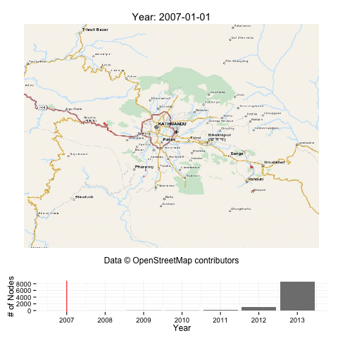
First, for a quick review, lets load up the Kathmandu dataset, and pick out just 10,000 nodes out of the dataset, and produce the default visualization. We do this for speed of iteration; you may want to work with a small dataset first when customizing visualizations for your own dataset.
require(OSMTimeLapseR)
data(kathmandu_2013)  # load the default kathmandu dataset
set.seed(1)  # you can skip this. This sets the seed so we get the same random 10,000 values.

rows_to_select <- sample(1:nrow(kathmandu_2013), 10000)  # 10,000 random row indexes
kathmandu_small <- kathmandu_2013[rows_to_select, ]
saveGIF({
    time_lapse(kathmandu_small, "year", basemap_type = "mapquest")
}, movie.name = "kathmandu_custom1.gif", interval = 1, outdir = normalizePath("../demo/"))
To figure out all of the options that you can customize, you can look at the help with ?time_lapse. You’ll note that the last argument is written as ... (R’s short-hand for any other arguments), which the help notes say are passed on to plot_single_timeunit. So lets look at the arguments that that function takes.
?plot_single_timeunit
So looks like we can customize the “highlight” color, the “base” color, the background, and the size and alpha (or opacity) of the dots that get drawn. So lets go crazy!
saveGIF({
    time_lapse(kathmandu_small, "year", basemap_type = "none", highlight = "yellow",
        base_color = "white", bg_color = "black", size = 2, alpha = 0.2)
}, movie.name = "kathmandu_custom2.gif", interval = 1, outdir = normalizePath("../demo/"))
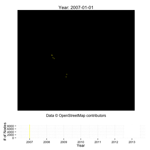
At the moment, the background color change only makes sense with a blank basemap, and it only affects the frame of the map. You can play with other values for each of the fields, and hopefully come up with something that you like!
Beyond the point cloud
As much as you change those options, you’ll be stuck with the basic pattern of the visualization – the current time-unit point-cloud overlaid over all of the past points, in a highlighted color, and a histogram on the bottom. You could do more fun things if you wanted and knew ggplot2 better. Here is an example with a heat map instead of a point cloud; I’ll ignore the previous data as well as the histogram below in this example:
### The default arguments that you will need to implement are the following.
### You can ignore them if you want, but must list them in your function
### before and this are data.table objects with lat/lon/timestamp
### total_by_timeunit should have one row per timeunit with the # of points in
### that timeunit
plot_custom = function(before, this, total_by_timeunit, timeunit_pretty, basemap) {
    if (nrow(this) < 20)
        return()  # density plots don't make sense until you have 20 points or so
    this_timeunit = unique(this$timeunit)
    ## Lets plot! We'll make a heatmap of just the current (ie, 'this') data
    ## here.  I'll make a density2d-polygon. As long as you preserve the
    ## aes(x=lon, y=lat), you can play with different styles of plots
    plot <- basemap + geom_polygon(data = this, aes(x = lon, y = lat, fill = ..level..),
        alpha = 0.5, stat = "density2d") + scale_fill_gradient(low = "yellow",
        high = "red") + OSMTimeLapseR:::blank_theme() + labs(x = "Data © OpenStreetMap contributors",
        title = paste(timeunit_pretty, this_timeunit, sep = ": "))
    print(plot)
}
I present just the final version here, but I iterated with it quite a bit before I settled on this as a decent custom plot example to show. To test whether or not some version of this code is working for me, I test it with some sample data. In this case, lets test it with what a single plot in the year 2012 would look like.
To do this, we’ll need to:
* calculate the timeunit attribute, a rounded version of timestamp. This is normally done by the time_lapse function, which we are bypassing.
* Second, we’ll want to download an OSM basemap. Again, part of the time_lapse function.
* Finally, we’ll call plot_custom just on the 2012 snapshot.
# Calculate timeunit (at a yearly aggregation):
kathmandu_small[, `:=`(timeunit, round_date(timestamp, "year"))]
# Download the basemap (note that this also caches the basemap for us)
basemap <- get_ggbasemap(lat_range <- range(kathmandu_2013$lat), lon_range <- range(kathmandu_2013$lon),
    type = "mapquest")
# Now, we call plot_custom. Note that we create 'before' and 'this' datasets
# inline
plot_custom(before = kathmandu_small[timeunit < ymd("2012-01-01")], this = kathmandu_small[timeunit ==
    ymd("2012-01-01")], timeunit_pretty = "Year", basemap = basemap, total_by_timeunit = NULL)
Okay, thats interesting enough for the example. So lets run the code on the whole kathmandu_2013 (and go get some coffee :)
saveGIF({
    # this time, we pass in our function into `plot_single_timeunit`
    time_lapse(kathmandu_2013, "year", plot_single_timeunit = plot_custom, basemap_type = "mapquest")
}, movie.name = "kathmandu_custom.gif", interval = 1, outdir = normalizePath("../demo/"))
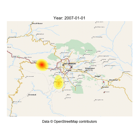
Cool! Its a pretty cool pattern, actually… looks like the locus of editing in Kathmandu is moving much more inward towards the city itself.
Creating your own custom visualization is just a matter of writing a plotting function using the data structures like we did above. For more depth beyond what was covered, feel free to read the source of time_lapse and plot_single_timeunit.
Customizing the basemap
In the above examples, we have drawn visualizations sometimes without a basemap, and sometimes with the mapquest basemap. OSMTimeLapseR utilizes the OpenStreetMap R package to download basemaps; at present, the types suppoted by OpenStreetMap are supported (see this article for which those are). We hope in the future to be able to add support for arbitrary mapbox maps.
Final Thoughts
As I said in the beginning, you won’t get all the cartographic features of something like CartoCSS and mapnik here, but you can still do some cool stuff! If you want to dig deeper, I would definitely suggest looking at ggplot2 in more depth.
If you do build something cool, please do post it on the wiki for this project.